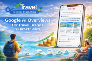
Great Destinations, Poor Conversions What’s the Disconnect?
The problem isn’t your destination. It’s your website experience.
Travel websites face a unique challenge: people want to be inspired, but also want quick info and easy decisions. Yet many agencies still rely on clunky layouts, outdated visuals, or bloated booking funnels.
Travel & Tour Digital Marketing has analyzed hundreds of travel websites, and the patterns are clear. In this guide, we reveal why even high-traffic travel sites struggle to convert and how smart, user-focused design changes can fix it.
You’re Designing for Desktop While Your Customers Are on the Go
70-80% of travel searches now begin on mobile. Most travel and tour websites still prioritize desktop UX, slow loading images, or non-mobile-friendly calendars.
Your potential customers are browsing vacation packages during lunch breaks, commutes, and evening downtime. If your site doesn’t work seamlessly on their phone, they’ll book with someone whose site does.
The fix starts with mobile-first design. Use click-to-call buttons, sticky “Book Now” CTAs that stay visible during scrolling, and fast-loading itineraries. Most importantly, test your booking flow on actual mobile devices, not desktop previews.
Your Site Looks Good But It Doesn’t Guide Anyone
Pretty doesn’t always convert. Aesthetic doesn’t equal strategic.
Travel buyers need visual hierarchy that tells them where their eyes should go and a linear flow: Explore > Learn > Trust > Book. Many travel websites create beautiful galleries but forget to guide visitors toward the next step.
Create clear CTAs above the fold like “View Packages” or “Check Dates.” Design a visual journey flow with compelling images, itinerary preview, then conversion action. Use heatmap testing tools like Hotjar to spot where visitors drop off, and remove competing elements that distract from your primary goal.
Professional travel website design focuses on guiding visitors through this journey, not overwhelming them with choices.
You Forgot to Sell the Experience, Not the Logistics
Too many sites focus on dates, pricing, and forms without emotionally engaging the visitor. Travel is aspirational. People don’t book trips for the logistics they book for the transformation, adventure, and memories.
Add storytelling content through video, destination highlights, and detailed testimonials. Use persuasive UX writing like “Explore Bali Like a Local” instead of “Bali Tours.” Insert trust-building microcopy near buttons such as “100% Refundable. No Hidden Fees.” Show the outcome, not the process.
Your Booking Flow Is a Friction-Filled Nightmare
Common issues that kill conversions include 5+ step booking processes, mandatory account creation, and unclear date selectors or availability errors.
Every additional step in your booking process loses potential customers. The goal is removing barriers between interest and purchase. Streamline to 2-3 steps maximum and allow guest checkout without login requirements. Add live availability tools and show progress indicators so users know how much more effort is required.
No Social Proof Where It Matters Most
Visitors want validation before they commit, especially on high-cost tours. Most sites bury reviews or testimonials on a separate page instead of placing them where decisions happen.
Social proof works because travel purchases involve significant financial and emotional investment. People need reassurance that others have had positive experiences. Pull in reviews from Google, TripAdvisor, and Trustpilot directly under CTAs. Use real traveler photos and videos rather than stock imagery, and display recent booking notifications like “Sarah from Denver booked this tour 2 hours ago.”
Your Content Strategy Is Causing Confusion
If your homepage mixes blog posts, random destinations, and outdated banners, visitors feel lost. They can’t figure out what you offer or how to book it.
Clarify your site architecture with a clear path: Destinations → Packages → Booking. Use smart filters for trip length, budget, and theme. Your blog content should guide traffic to packages, not act as the final destination. Create navigation that matches how people think about travel planning.
This connects to broader SEO strategies for travel operators that drive the right traffic to well-structured pages.
Your Page Speed and Load Time Are Killing the Vibe
Page speed affects bounce rate and SEO rankings. Heavy photos, sliders, and embedded maps often slow travel sites down. When someone’s excited about a potential trip, waiting for pages to load kills their momentum.
Compress images with TinyPNG or WebP format, remove unused scripts and plugins, and lazy-load media content. Choose hosting that handles traffic spikes during peak booking seasons.
Your CTA Buttons Sound Like You Don’t Want Bookings
Vague CTAs like “Submit” or “Click Here” don’t inspire action. Your button copy should match the excitement level of travel planning.
Use benefit-driven copy such as “Check Availability,” “Start Planning,” or “Get My Quote.” Match CTA language to visitor intent level and test different colors and placement for maximum impact.
Does Your Website Feel Like a Booking Concierge or a Travel Brochure?
A brochure informs. A concierge converts.
Ask yourself: Can a user land on your site, explore options, build trust, and book within 3 minutes? If not, it’s time to rethink your structure, copy, and design strategy.
The best travel websites anticipate questions, remove friction, and make booking feel effortless. They understand that people want to spend their mental energy dreaming about their trip, not figuring out how to book it.
Ready for a UX Overhaul That Actually Drives Bookings?
Travel & Tour Digital Marketing helps agencies and tour operators fix conversion-killing websites and turn browsers into bookings. We understand the unique challenges of travel marketing and know what drives people to book.
Your travel website doesn’t need more features it needs a better flow. With clear CTAs, trust signals, fast UX, and conversion-focused design, you can inspire and convert in one visit.
Ready to see what your website could be doing? Schedule your free consultation today and let’s turn your traffic into confirmed bookings.